
HTML レイアウトの例
<html lang=”en”>
<head>
<title>CSS Template</title>
<meta charset=”utf-8″>
<meta name=”viewport” content=”width=device-width, initial-scale=1″>
<style>
* {
box-sizing: border-box;
}
body {
font-family: Arial, Helvetica, sans-serif;
}
/* Style the header */
header {
background-color: #666;
padding: 30px;
text-align: center;
font-size: 35px;
color: white;
}
/* Container for flexboxes */
section {
display: -webkit-flex;
display: flex;
}
/* Style the navigation menu */
nav {
-webkit-flex: 1;
-ms-flex: 1;
flex: 1;
background: #ccc;
padding: 20px;
}
/* Style the list inside the menu */
nav ul {
list-style-type: none;
padding: 0;
}
/* Style the content */
article {
-webkit-flex: 3;
-ms-flex: 3;
flex: 3;
background-color: #f1f1f1;
padding: 10px;
}
/* Style the footer */
footer {
background-color: #777;
padding: 10px;
text-align: center;
color: white;
}
/* Responsive layout – makes the menu and the content (inside the section) sit on top of each other instead of next to each other */
@media (max-width: 600px) {
section {
-webkit-flex-direction: column;
flex-direction: column;
}
}
</style>
</head>
<body>
<h2>CSS Layout Flexbox</h2>
<p>In this example, we have created a header, two columns/boxes and a footer. On smaller screens, the columns will stack on top of each other.</p>
<p>Resize the browser window to see the responsive effect.</p>
<p><strong>ノート:</strong> Flexbox is not supported in Internet Explorer 10 and earlier versions.</p>
<header>
<h2>Cities</h2>
</header>
<section>
<nav>
<ul>
<li>London</li>
<li>Paris<</li>
<li>Tokyo</li>
</ul>
</nav>
<article>
<h1>London</h1>
<p>London is the capital city of England. It is the most populous city in the United Kingdom, with a metropolitan area of over 13 million inhabitants.</p>
<p>Standing on the River Thames, London has been a major settlement for two millennia, its history going back to its founding by the Romans, who named it Londinium.</p>
</article>
</section>
<footer>
<p>Footer</p>
</footer>
</body>
</html>
上のHTMLを表示するとレイアウトが要素ごとに表示されることが確認できます。
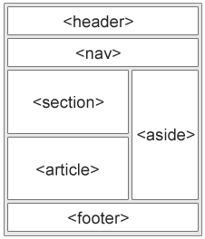
HTMLレイアウト要素
Webサイトでは、コンテンツを複数の列に表示することがよくあります(雑誌や新聞みたいに)
HTMLは、Webページのさまざまな部分を定義するいくつかのセマンティック要素を提供します。:
HTMLレイアウト手法
複数列レイアウトを作成する方法は5つあります。それぞれの方法には長所と短所があります。:
- HTMLテーブル(非推奨)
- CSS floatプロパティ
- CSSフレックスボックス
- CSSフレームワーク
- CSSグリッド
どれを選ぶか?
HTML テーブル
<table>要素はレイアウトツールとして設計されていません。
<table>要素の目的は、表形式のデータを表示することです。 そのため、ページレイアウトにテーブルを使用しないでください。使用してしまうとサイトを再設計することがどれほど難しいか想像してみてください。
ヒント: 上記のことからページレイアウトにテーブルを使用しないでください!
CSS フレームワーク
早くレイアウトを作成したい場合は
W3.CSS や Bootstrapなどのフレームワークを使用できます 。

コメント